
The Lightness of the French Riviera: A Light-Filled Home
The Lightness of the French Riviera
It's early afternoon, and the air is warm but not heavy.
Light reflects off the bright facades of houses, and everything around feels slowed down – not from fatigue, but from a natural calm.
Somewhere in the distance, an awning stirs, a glass lightly clinks on a table, and the sea is only hinted at, not necessary to see. Everything is quiet, yet not empty. Present, yet unforced.
Perhaps cinematic images come to mind – Louis de Funès in the slightly chaotic rhythm of life, Brigitte Bardot on the beach, scenes we know more as a feeling than a concrete story. The French Riviera is often more film than place.
And it is this very atmosphere that can be brought home.

A Table Bathed in Light
On the Riviera, a table isn't an event, but a natural part of the day. Lunch stretches out, dinner transitions into night, and nothing feels interrupted. Everything is calm, yet precise.
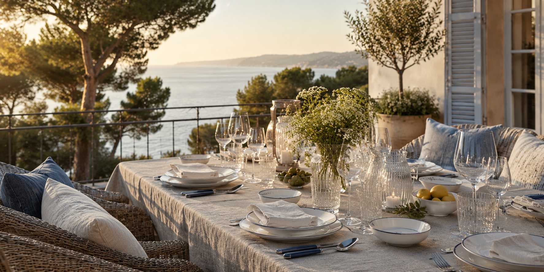
Porcelain carries character without needing attention – ideally light, sometimes with a subtle blue line that quietly alludes to the sea. Combined with linen, it forms a foundation that doesn't demand attention but holds the whole together.
Gien works very well, complemented by cutlery from Alain Saint-Joanis. Glass remains light and thin-walled; crystal is only used when it interacts with light, not for effect.
How to create a Riviera table at home
Porcelain
- light porcelain in white or cream
- a very elegant combination is white with a delicate blue line, hinting at the sea and coast
- ideally a timeless service without seasonal motifs
Cutlery as table jewelry
- quality cutlery
- delicately shaped handles, emphasis on detail and balance
- perceiving cutlery as an aesthetic object
Textiles
- linen tablecloths in natural shades: sand, ivory, light gray
- natural material is more important than decoration
- napkins in the same material
Table accessories
- thin-walled glass that allows the color of drinks to shine
- if crystal, then a clean shape, not a historical decor. It works with light refraction, not a "display of luxury"
- small porcelain bowls for appetizers
- caviar bowl as a subtle luxurious detail
- candleholders of clear or frosted glass without significant decoration
Table composition
- work with free space between individual elements
- combine a maximum of three materials within one table
- let light stand out as part of the serving
- choose each element with a clear intention, not as an extra decoration

Terrace as a natural extension of the house
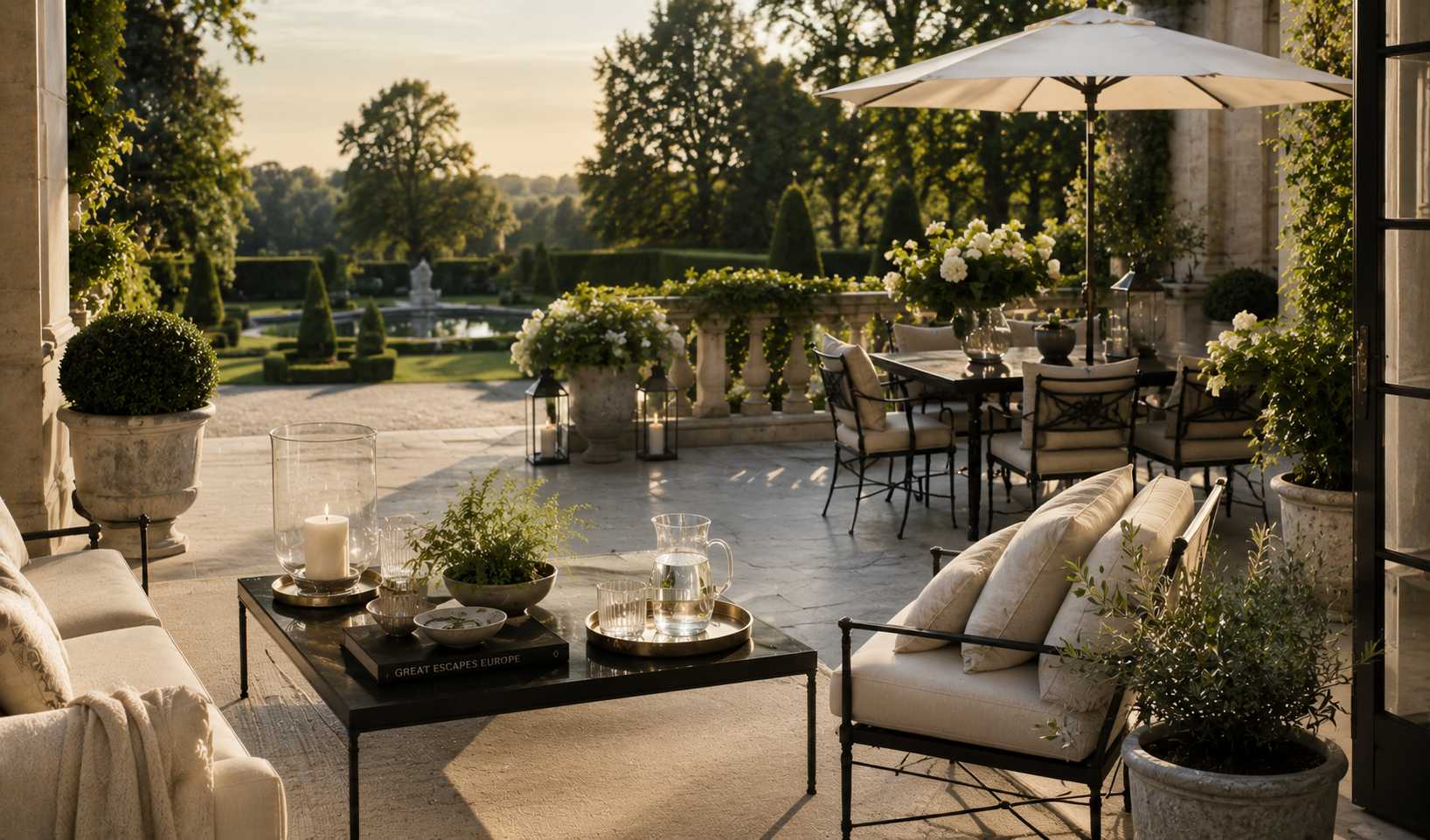
Life doesn't divide outdoors; it continues. The terrace connects to the interior seamlessly, as if there was never a boundary between them. The morning moves outside, the evening returns inside, naturally, without a change in rhythm.
On the Riviera, interior and exterior are often perceived as one whole. Everything is interconnected by materials, air, and a way of life that doesn't separate inside and out, but lets them flow together.
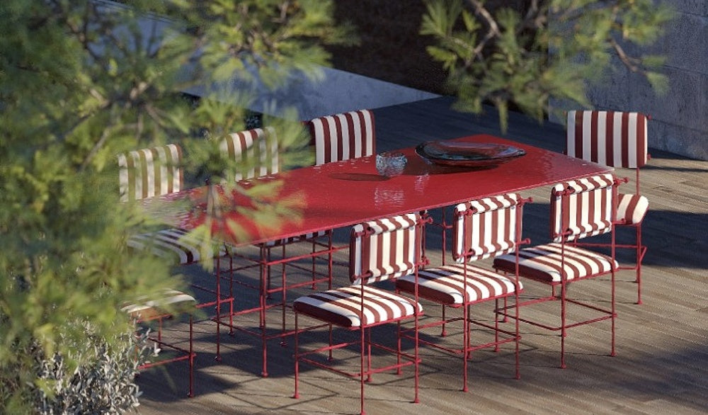
The terrace is a place where comfort, simplicity, and quiet luxury meet. It feels relaxed, yet nothing in it is accidental, from the choice of furniture to the texture of textiles. The furniture is simple and light, based on natural materials. Rattan, teak, or metal in light tones form a base that doesn't feel heavy.
It's important that the terrace is as pleasant for morning coffee as it is for evening gatherings with friends, without needing to change it, just using it naturally.
How to create a Riviera terrace at home
Outdoor furniture
- rattan, teak, or a combination of natural textures and metal
- simple silhouettes
- emphasis on comfort
Textiles for outdoor spaces
- linen or cotton cushions
- colors: sand, ivory, light blue
- stripes or subtle textures, but without prominent patterns
- only a few shades
Lighting
- lanterns of frosted or clear glass
- indirect light that "envelopes" the space in the evening
- depending on the layout, a combination of floor and hanging elements
Space composition
- one main seating area instead of many small zones
- ample free space around the furniture
- connection with the interior through the same textile colors
- minimal decorations, emphasis on material and proportions

Interior as a calm backdrop for life
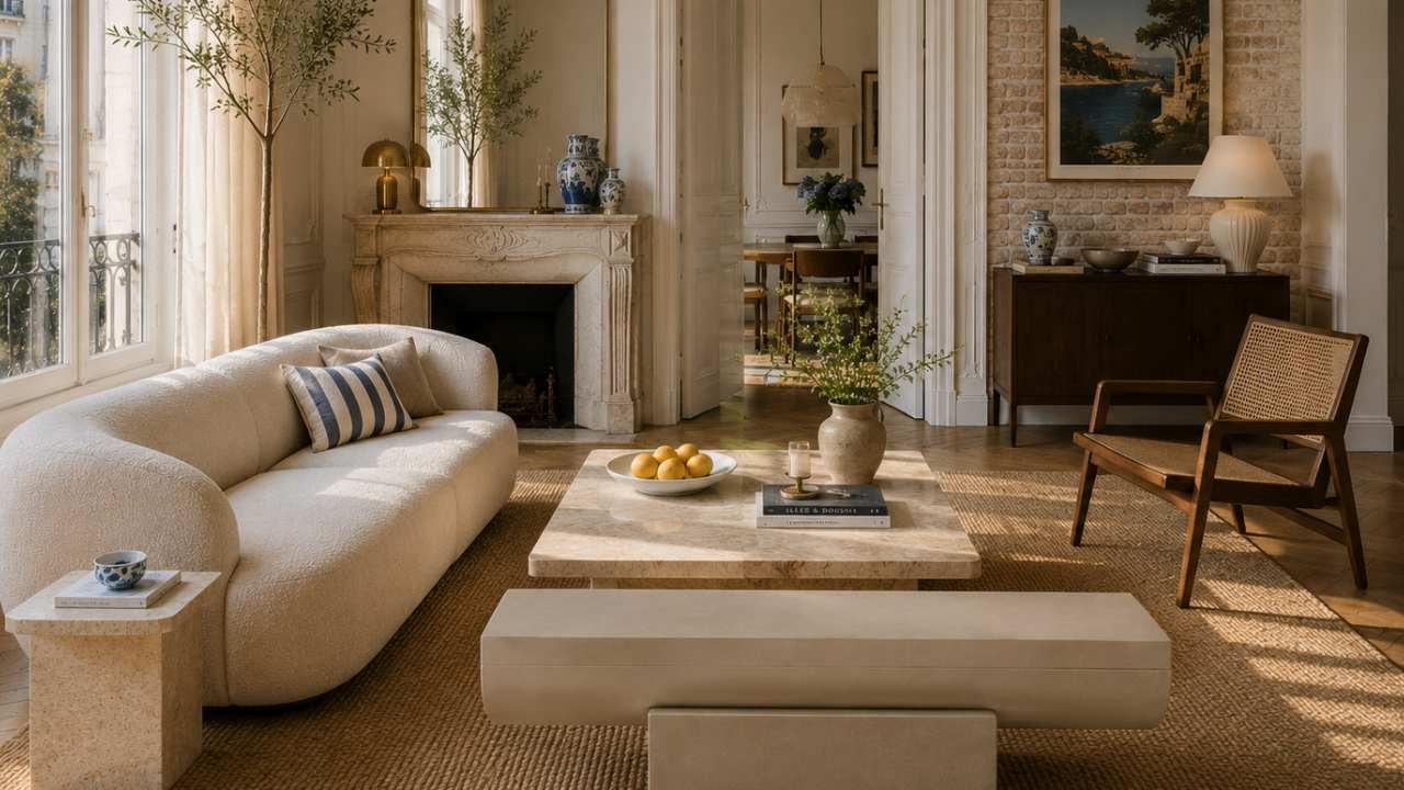
The interior on the French Riviera is not the main stage, but a carefully composed backdrop for daily life. Sometimes it appears very architectural and clean, sometimes a little more relaxed, but always with clear control over materials and proportions. The space is not cluttered, but balanced.
The foundation is not decoration, but surfaces. Walls, textiles, and furniture form a single entity, alternating calm, texture, and only an occasional accent. Patterns appear, but never overpower the space; rather, they subtly structure and complement it.
The interior thus does not feel "furnished," but curated.
How to create a Riviera interior at home
Walls: texture as a foundation
- fine mineral plasters, lime surfaces or natural stone effect
- ideally matte, without gloss and visual noise
- an alternative is high-quality textured wallpaper
- goal: to unify the space, not to decorate it
Wallpaper: pattern only as an accent
- pattern yes, but only in a limited role (e.g., one wall or alcove)
- subtle stripes, botanical motifs, or hand-painted looking murals
- luxurious interpretation: de Gournay
- more modern approach: Élitis (textures, natural structures without a prominent motif)
- rule: the pattern must never define the entire space
Textiles as soft architecture
- linen in neutral tones (sand, ivory, light gray)
- combination of a maximum of 2–3 shades in a room
- layering materials, but without visual competition. Combine multiple materials so they harmonize, but none of them demand attention.
- emphasis on texture, not decoration
Furniture and proportions
- lower, wider seating elements with a simple silhouette
- light wood, stone, matte metal
- minimum of standalone pieces, more "quiet zones"
- each piece has clear space around it
Space composition
- fewer objects
- repetition of materials
- decorations only as solitary elements (ceramics, glass, art)
- emphasis on overall harmony, not individual "statements of beauty"
-
always let one material dominate and others only support it
Art: calm, large-format, without visual clutter
On the Riviera, art is not decoration in the usual sense. It is not added to a space to beautify it, but to give it calm depth and character. It functions as part of the architecture, sometimes as a personal, very carefully selected element.
It's important that art here never creates visual competition. It doesn't overload walls, divide space into sections, or compete with furniture or textiles. On the contrary, it unifies and calms the space.
A painting or object always has a clear role: either it defines one wall, or it subtly complements the room's atmosphere.
How to work with art
Large format as a foundation
- one dominant painting or object is better than several smaller ones
- the painting or object should be visible and effective from a distance, not just up close
- motifs for paintings: abstraction, architecture, seascapes, light compositions
Frame as part of the whole
- simple, thin frames
- no ornaments or ornate profiles
- the frame must not compete with the painting
Color scheme
- muted tones: sand, gray, off-white, soft blue
- emphasis on tonality, not contrast
- the painting should be part of the space, not an extra accent
Placement
- ideally one dominant wall in the room
- plenty of empty space around the artwork
- hanging height should be calm, not gallery-like
Space complementation
- no other small paintings on the same wall
- if multiple works, then as a series in a single line and format
- combination with ceramics or textiles only very cautiously

Conclusion
The French Riviera is not a place that can be precisely replicated. It's a way of looking at space, with calm, an eye for detail, and respect for what truly matters. When this approach is brought home, it creates an atmosphere, not a copy. A space that feels naturally balanced because it is based on a careful selection of things that can coexist harmoniously over time.
At PERDONAHOME, we select items that embody aesthetic quality, craftsmanship, and timeless character. These are things meant for a long-term relationship with a space. Things that age naturally and quietly deepen the atmosphere of a home.
What emerges is not an effect or a style. It's a quiet luxury that isn't overtly displayed, but felt in every detail.
Whether you start with a single element or transform an entire interior, it's always about the same thing: making your home feel like a place where you truly belong – naturally, calmly, and with a lightness that endures.
